Growth and greed are the enemies of craft and quality. We changed the playing field for ourselves and anyone who wants to join us. We aim to show how a small, multi-disciplined team of creatives can outperform large behemoth agencies, creating award-winning work. And we can do that while providing competitive salaries, excellent benefits, and incredible opportunities for individual growth for every associate.
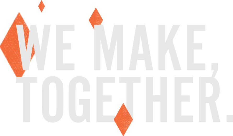
There’s a solid foundation of focus and passion for our work, camaraderie between coworkers, and respect for our clients that everything else continually pivots upon. We listen. Then we make. Visual systems, illustrations, icons, photographs, video, motion graphics, code, interactions, tools, products. Our individual passions help us approach problems differently, as a team. We work together to create something better than what we can make alone.
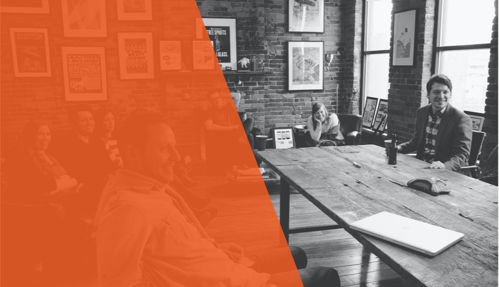
At Bonfire Red, you experience an environment where great work and shenanigans coexist. No doubt, the work always comes first. The shenanigans are sprinkled in between the making. They are a bi-product of our commitment to stay small, by design, and cultivate amazing relationships with every single associate in the studio.
Something about it ain't right. But that's alright.
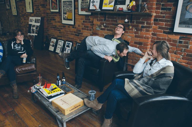
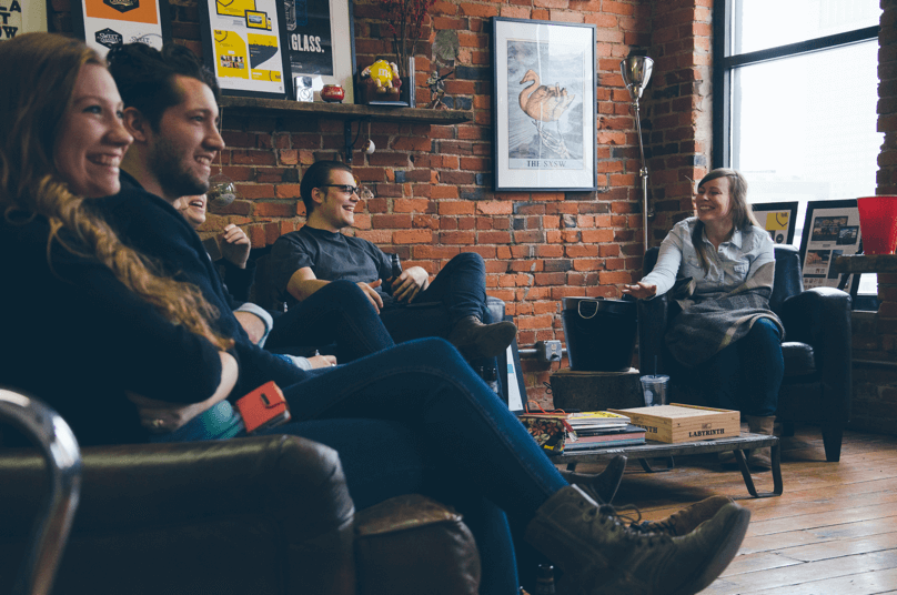
It’s designed to be inviting. Familiar. Comfortable.
Inspiring and functional. Lived in.
We lunch together.
We wash our own dishes.
We hijack the playlist.
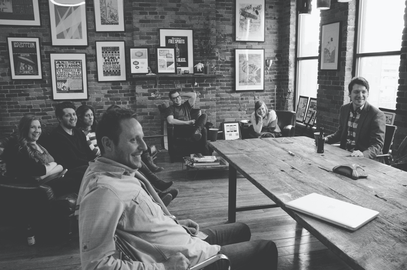
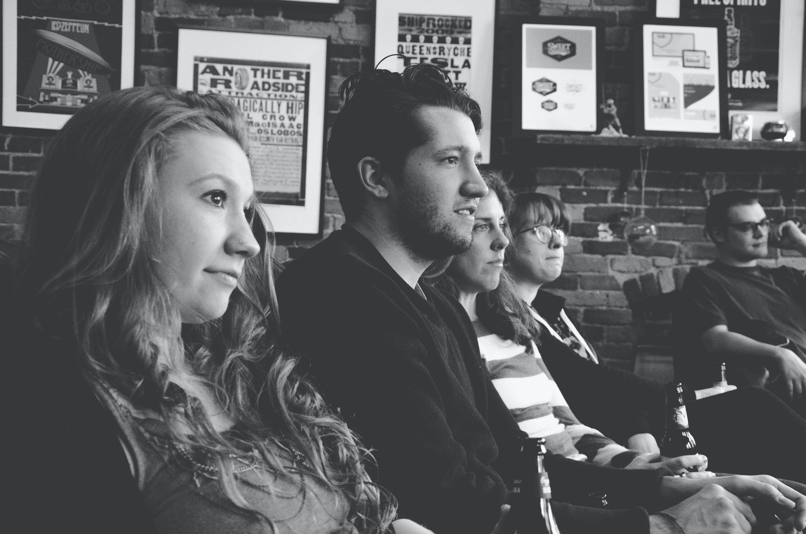
There are no weak links.
Everyone has voice.
Everyone has a seat at the table.
We learn from our losses.
We celebrate a lot. About anything.
Its pretty fam up in here.
We partner with brands of all sizes to strengthen their brand presence to their customer base. We are industry agnostic. What is consistent about our best Clients, is that they are open to a digital-first mentality. We collectively agree that a brand’s visual system should embrace technology to demonstrate how a brand sounds, looks, and moves.
Great work takes great talent. And Columbus, Ohio is saturated with some of the best in the country. We aim to attract talent with a love for all things graphic design, who have an entreprenurial spirit, who believe in the power of collaboration and have a delicious thirst to learn.
We’re all different names for the same thing — A Maker. We’re all problem solvers, tinkerers, thinkers, and doers cut from different cloth. Creative is what binds us. There’s no red tape on a good idea, and we’ve all got a seat at the table.
We handpick for chemistry and quality and our partners are part of the pack.
Game recognizes game.
We’re passionate about passion. It’s at the heart of everything we do and it's louder than words. It’s in our DNA and quite frankly, we just can’t help ourselves.
We do things a little differently. We let people be themselves. We don’t enjoy walking on eggshells, so it’s up to you to figure out how to approach a problem at work. With this type of freedom comes a culture of ownership and responsibility. Don’t fuck it up. For yourself, or the rest of us.
Bonfires bring people together. To tell stories. To enjoy one another. To gaze into its beauty. Red is the color of passion. For better or worse, we wear it on our sleeve every day.
Inspired by our love for constructivist poster design, we had a preference for sharp angles and straight lines rather than curves.

Comprised of 3 elements, representing our 3 core values as a company.

Passion is our flame. It’s in our DNA.

Creative is our core. It’s what binds us.

Clients are our kindling. The fuel that keeps us going.

City Bold is used as our primary typeface in the logo (BONFIRE), matched with Futura Medium used to compliment and povide visual hierarchy to the lockup.

In 1930, at the tail end of the constructivist movement, renowned typehouse Berthold released City, a bold, angular slab serif evoking an industrial, urban feeling.

In 1927, Bauer Type Foundry released a geometric sans-serif typeface, Futura, based on triangles, squares and near-circles.

To be used when space allows.

To be used for horizontal compositions.

To be used for square or vertical compositions.

Only for use in small scale application where size and legibility prelude the use of other options.
Always leave space around the logo equal to the width of the symbol.
When applied to light fields of color, use the ash and red logo.
When applied to dark fields of color, use the white and red logo.
When applied to white fields in black/white, use the black logo.
When applied to grey/black fields in black/white, use the white logo.
When applied to white fields in black/white, use the black logo.
Don’t stretch or distort the logo.
Don’t rotate the logo.
Don’t add extra effects to the logo.
Don’t use non-brand color on the logo.

Use the horizontal logo when matching with another horizontal logo. Distance between two logos are equal to 2x symbol width. Use a 45° Judge Grey line with 60% opacity between the logos.

When applied to light fields of color, use the ash and red logo.
Alternate Gothic #2 is used for headlines and things we want to say loudly. Slap a cap on that, and let's roll.
Some say it's a dirty font, yet we think it's a legible slab serif perfect for body copy and pull quotes.
Open source via Latinotype (http://www.latinotype.com/)
Sometimes we want a sans serif for body copy. A versitile alternative to condesed all-caps.

Donec nec justo eget felis facilisis fermentum. Aliquam porttitor mauris sit amet orci. Aenean dignissim pellentesque felis.
Donec nec justo eget felis facilisis fermentum. Aliquam porttitor mauris sit amet orci. Aenean dignissim pellentesque felis.
Donec nec justo eget felis facilisis fermentum. Aliquam porttitor mauris sit amet orci. Aenean dignissim pellentesque felis.

Donec nec justo eget felis facilisis fermentum. Aliquam porttitor mauris sit amet orci. Aenean dignissim pellentesque felis.
Donec nec justo eget felis facilisis fermentum. Aliquam porttitor mauris sit amet orci. Aenean dignissim pellentesque felis.
Donec nec justo eget felis facilisis fermentum. Aliquam porttitor mauris sit amet orci. Aenean dignissim pellentesque felis.
Donec nec justo eget felis facilisis fermentum. Aliquam porttitor mauris sit amet orci. Aenean dignissim pellentesque felis.
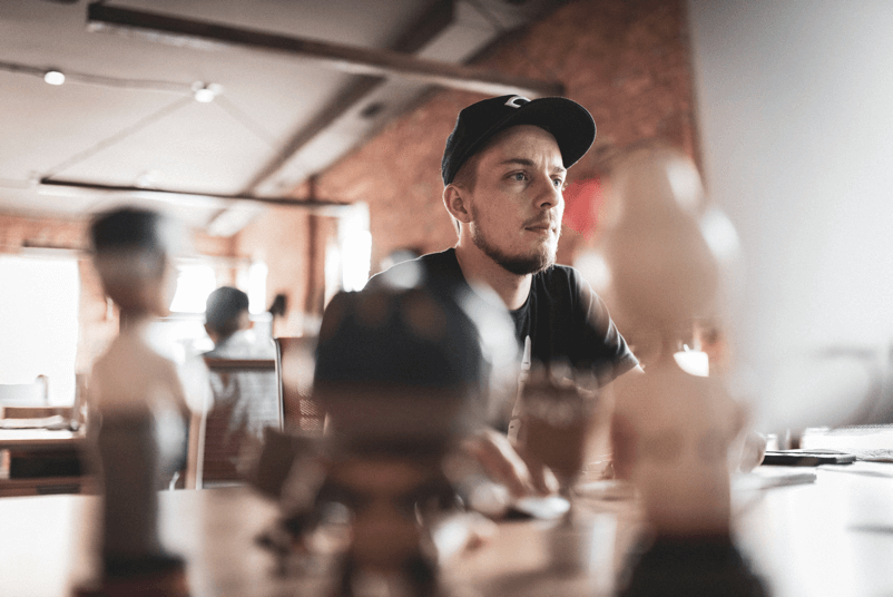
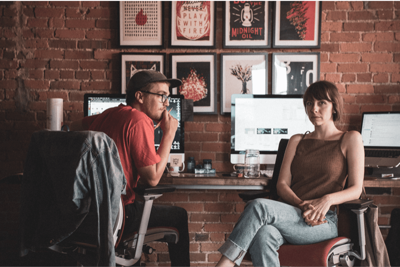
Created by photographer & design director, Holly Malone. The photography representing Bonfire Red exude a warm, film-like, feel. Beautiful bright tones and soft, warm effects to make clean natural light effects every time.
Created by photographer & design director, Holly Malone. The photography representing Bonfire Red exude a warm, film-like, feel. Beautiful bright tones and soft, warm effects to make clean natural light effects every time.
Created by the lack of color, we often desaturate to help create more emotion. Along with this, we add a very fine grain and softly sharpen the images.
Let’s give them a flavor of what it’s like to work with us:
Proud. Passionate. A little rough around the edges. Meet me at LP, and let’s have a conversation - That's what it sounds like.
| Name | Font Family | Font Size | Line Height |
|---|---|---|---|
| Heading 1 | Alternate Gothic #2 | 130px | 100px |
| Heading 2 | Alternate Gothic #2 | 40px | 34px |
| Sub Title | Alternate Gothic #2 | 22px | 18px |
| Text 1 | Sanchez | 16px | 28px |
| Text 2 | Sanchez | 12px | 20px |


Checkbox
Radio
The challenge of this project was to bring Design Central's unique culture, passion for clients, depth of expertise and strategic drive to life through storytelling. Our team met this challenge head-on and the result is work we're all incredibly proud of.Kyle Harrington
Donec nec justo eget felis facilisis fermentum. Aliquam porttitor mauris sit amet orci. Aenean dignissim pellentesque felis.
Donec nec justo eget felis facilisis fermentum. Aliquam porttitor mauris sit amet orci. Aenean dignissim pellentesque felis.
Donec nec justo eget felis facilisis fermentum. Aliquam porttitor mauris sit amet orci. Aenean dignissim pellentesque felis.
Donec nec justo eget felis facilisis fermentum. Aliquam porttitor mauris sit amet orci. Aenean dignissim pellentesque felis.
Donec nec justo eget felis facilisis fermentum. Aliquam porttitor mauris sit amet orci. Aenean dignissim pellentesque felis.
Donec nec justo eget felis facilisis fermentum. Aliquam porttitor mauris sit amet orci. Aenean dignissim pellentesque felis.
Donec nec justo eget felis facilisis fermentum. Aliquam porttitor mauris sit amet orci. Aenean dignissim pellentesque felis.